Sztuka
Nałogu
Branding
Sztuka Nałogu (en. The Art of Addiction) is a podcast that gives voice to people who have faced addiction and found their way back through art. Music, painting, design - the conversations are as varied as the people behind them. My role was to create a visual identity that reflects both the weight of these stories and the creativity they inspire - a balance of honesty and hope.
Logo Design
& Construction
The logo combines a typographic monogram and a wordmark. The wordmark itself brings together two contrasting elements: the delicate script Sztuka (en. art) and the bold, geometric Nałogu (en. addiction). This duality reflects the nature of the podcast - personal stories shaped by struggle and creativity.
The symbol is a monogram merging the letters S and N. Their intertwined form speaks to the same relationship between Sztuka and Nałóg - two inseparable forces, sometimes in conflict, but often creating something meaningful together.


The monogram is built on a geometric grid, combining circles, diagonal lines, and a rectangular frame. The letter S flows through rounded curves, while the N adds contrast with sharp, structured angles.
Each element follows clear geometric principles - curves and straight lines working together to create balance. The result is a symbol where the letters overlap and intertwine, reflecting the tension and connection between Sztuka (art) and Nałóg (addiction).
Key geometric principles:
Circular arcs define the main curves of the S
Consistent diagonal strokes form the N
A rectangular frame anchors the composition
A modular grid ensures balance between shapes and space
Rounded corners soften the overall form
Typography
& Colors
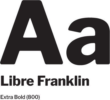
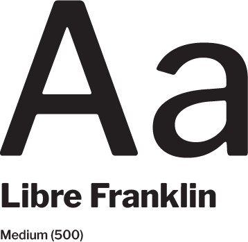
The typography is set in Libre Franklin, balancing modern clarity with a timeless feel.
Headings use Extra Bold for strong presence, while body text uses Medium for readability and warmth.

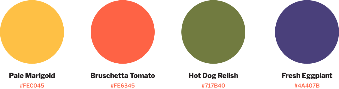
The primary colors create a strong, minimalist foundation—Abaddon Black and Crystal Cut reflect the podcast’s tone of honesty and clarity.
The secondary palette adds warmth and personality, introducing vibrant accents inspired by everyday life: Pale Marigold, Bruschetta Tomato, Hot Dog Relish, and Fresh Eggplant bring energy and contrast to the brand’s visual language.
Assets & Application
The branding comes to life across podcast visuals and social media. Below are some of the key assets prepared for the first episodes.


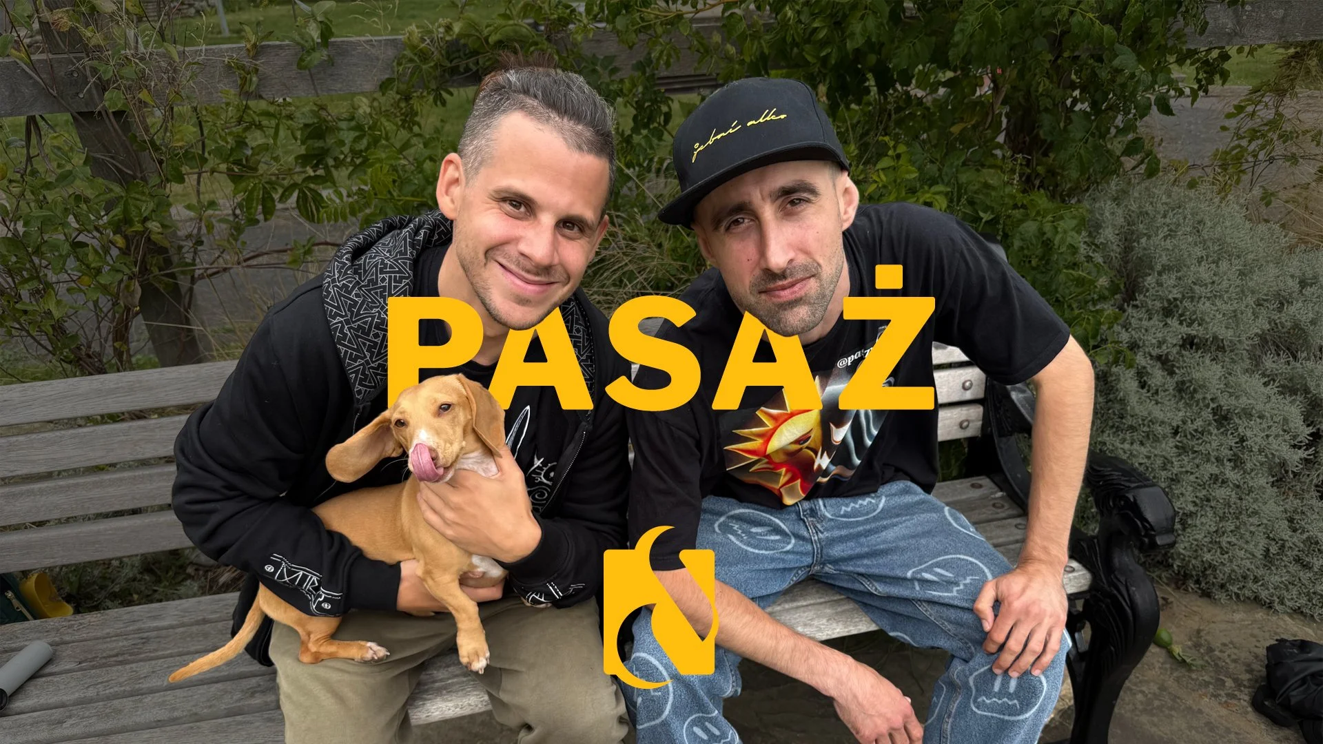
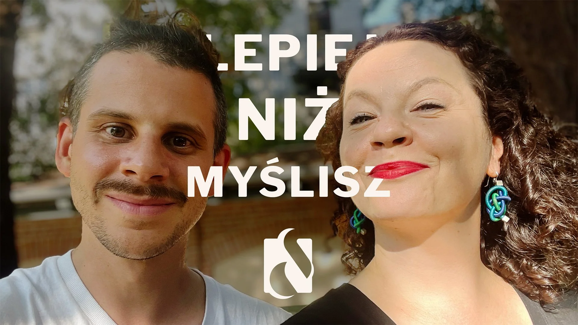
YouTube cover images: setting the tone before the conversation begins.
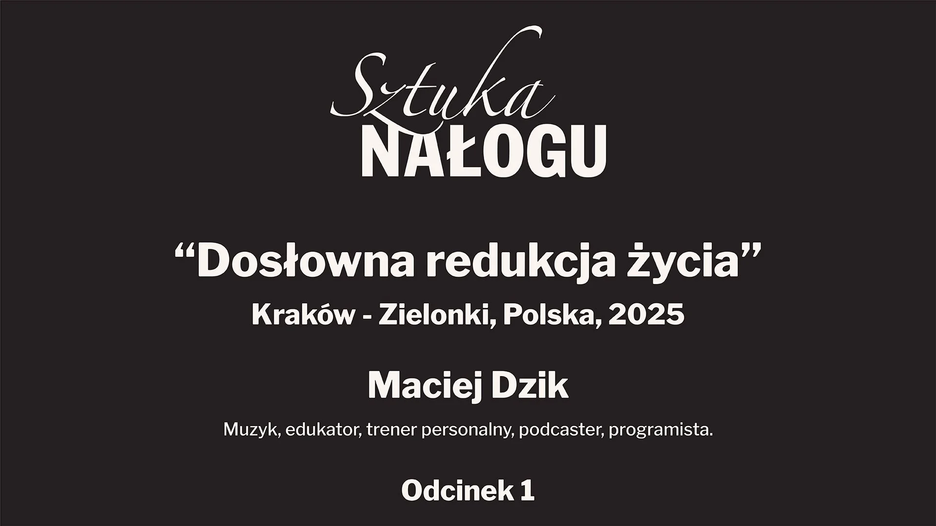
Title panel: a clean, readable intro slide used within the video.
Listen to the podcast
Want something custom-made?
Whether you’re starting a podcast, launching a brand, or have an idea you want to bring to life, I’m open for commissions.
Minimalist logos? Playful symbols? Full brand identity? Let’s make it happen.